International

Mastering the Art of Painting with a Limited Palette

Posted on 15 min read 84 views

When it comes to selecting colors for your limited palette, the possibilities are abundant. Your choice of colors will be influenced by the desired effect you wish to create, the subject matter of your artwork, and the medium you’re working with.

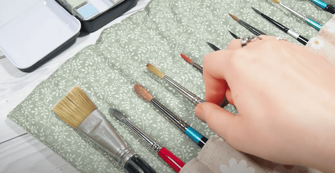
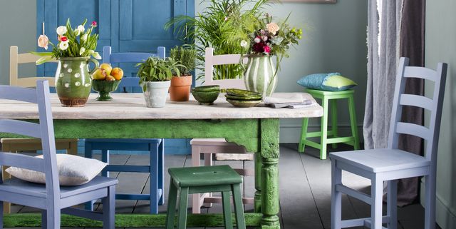
Utilizing a small yet diverse range of pigments in your paintings can offer numerous advantages to your artistic practice. By employing a limited palette, your artwork can exhibit a sense of organization and harmony that captivates the viewer.

Regardless of whether you work with oil painting, acrylics, watercolors, or any other medium, a limited palette allows you to skillfully mix a wide array of values and tones, unlocking endless possibilities for creative expression.

Unlocking the Power of a Limited Palette in Painting

Painting with a limited palette involves carefully selecting a minimal number of paint tubes to achieve a broad range of tones across the spectrum. It also entails choosing a precise quantity of pigments necessary to create colors that align with your artistic vision.

Typically, a limited palette consists of no more than six different colors, excluding white for tints and black or burnt umber for shades.

The specific pigments you choose for your palette will depend on the desired outcome of your artwork. For instance, if you aim to create muted tones with intense color contrasts, ideal for portraiture, the Anders Zorn palette featuring yellow ochre, blue-black, and light red could be an excellent choice.

Understanding the Significance of Primary Colors in Painting

paints on a palette, painting picture

In the realm of painting, the primary colors hold a crucial role. These pigments, in their purest form, consist of blue, red, and yellow, specifically known as cyan, magenta, and yellow.

However, relying solely on these three primaries limits the range of colors (gamut) that can be achieved. Many vibrant and deep hues remain outside the mixing capabilities of these pigments.

To overcome this limitation, many artists adopt a limited palette approach. They start with the primary colors and then expand their palette by incorporating additional colors that cannot be obtained through primary mixing alone, such as crimson.

In a six-color limited palette, each primary color is represented in both its warm and cool variations. This includes a warm blue leaning towards red, a cool blue leaning towards yellow, a cool red leaning towards blue, a warm red leaning towards yellow, a warm yellow leaning towards red, and a cool yellow leaning towards blue. By employing six pigments, artists utilize the fewest colors possible to create a broad range of hues. This enables them to achieve superior color contrasts compared to using fewer than six colors.

In this guide, all the listed palettes feature a dominant hue of a primary color, be it blue, red, or yellow. This selection facilitates the creation of contrasts in hue, shade, and temperature. For instance, the Anders Zorn palette consists of vermilion (red hue), ivory black (blue hue), and yellow ochre (yellow hue).

Benefits of a Limited Primary Color Palette

When aiming for realism in your artwork, opting for the six-color limited palette can prove highly advantageous. It offers a versatile range of colors that enable you to capture lifelike representations effectively. Additionally, this palette suits artists who enjoy experimenting with vibrant color variations and wish to avoid any constraints on their creative choices.

However, many artists prefer a more reductive approach, working with a smaller and more restricted color wheel. This allows them to focus on conveying mood and emotion rather than striving for realistic color representation. By utilizing alternative limited color palettes, artists can harmonize different areas of their artwork that might otherwise appear disjointed.

Regardless of the chosen palette, warm and cool tones are essential to create contrast in your painting. While the colors may not precisely match the real-life appearance of the subject, they can still evoke a similar impact. Instead, artists rely on value, the lightness or darkness of a color, to emphasize the structure and form of their artwork. This approach offers the freedom to be creative with the palette choice while maintaining the definition and visual impact of the subject.

Advantages of a Limited Palette in Painting

Discover the compelling reasons to embrace a limited palette in your artistic endeavors:

  • Create Harmonious Color Combinations:

Using a limited palette allows you to produce stunningly harmonious paintings. With fewer pigments at play, the colors seamlessly blend together, forming a visually cohesive composition. By employing contrasting colors on your palette, you can even neutralize disparate sections, establishing a strong visual relationship throughout your artwork. The limited palette encourages the exploration of subtle color graduations and nuanced variations.

  • Cut Art Supply Costs:

One practical benefit of working with fewer paints is the cost-saving advantage. With a limited palette, you not only spend less on art supplies but also require less space to store your tubes. If you aspire to paint in plein air or venture outdoors, the compact nature of a limited palette makes it more convenient to carry in your bag.

  • Improve Color Mixing Skills:

Using a limited palette enhances your ability to mix colors effectively. With a restricted set of pigments, you embark on a valuable training exercise, deepening your understanding of color theory and the relationships between different hues and values. By manually mixing various tones and hues, you gain insight into composition planning and meticulous consideration of each tone and value transition. This approach empowers you to create custom colors instead of settling for pre-manufactured tubes, further honing your color-matching skills. Moreover, the act of manually mixing colors transforms your perception of the world around you, heightening your sensitivity to the nuances of color.

  • Personalize Your Palette:

An artist’s palette is a personal reflection of their practice and style. Experienced artists often begin with a standard limited palette to learn the art of color mixing and subsequently tailor their palette to suit their unique preferences. As your skills develop, you can explore different color options and modify your palette accordingly, establishing a signature set of colors that resonate with your artistic vision.

Examples of Limited Palettes

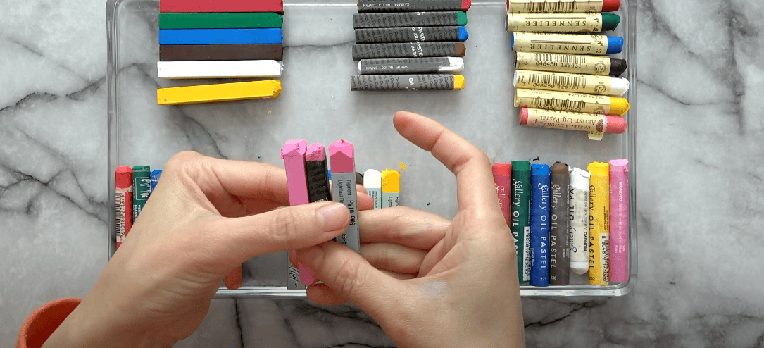
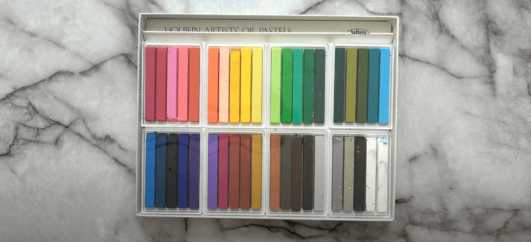
The selection of colors for a limited palette can vary depending on your chosen medium, subject, and desired effect. However, there are a few key colors that are commonly used across different palettes. Additionally, the addition of white and burnt umber or black is crucial for creating a range of values. Here are some essential colors to consider:

paints on the table, palette knife
  • Titanium White or Zinc White:

Titanium white is opaque and possesses strong covering power. It is excellent for creating highlights with significant impact. Zinc white, on the other hand, is translucent and less likely to make colors appear “chalky” when used on its own. Combining the two can result in more balanced highlights.

  • Burnt Umber:

Burnt umber is often preferred over ivory black by many artists. This earth pigment has reddish and yellow undertones and can be mixed with ultramarine blue to create a deep, intense black. It is useful for creating warm or cool shadows by adjusting the ratio of burnt umber or ultramarine blue. Additionally, burnt umber offers more transparency, making it suitable for creating transparent and fast-drying shadows as part of the initial paint layer.

  • Ivory Black:

Ivory black is commonly used in palettes like the Anders Zorn palette or cool monochromatic palettes. It has cool, bluish undertones and serves as a solid, cool black. However, modifying the color profile of ivory black without darkening it can be challenging. In contrast, burnt umber allows for more flexibility in modification. While ivory black is suitable for cool blacks or as a neutral blue in certain palettes, it can sometimes make colors appear dull compared to burnt umber.

Exploring the Split Primary Limited Palette in Oil Paint

One of the most widely used limited palettes in oil painting is the split primary palette. It offers a broad range of hues and allows for high chroma and vibrant color contrasts. This palette involves using both warm and cool versions of each primary color. Here are the key colors typically included in this palette:

  • Quinacridone Magenta (PV19):

This primary magenta color is cool in form but can be mixed to create vibrant oranges. It adds depth and intensity to your paintings, especially when combined with other colors.

  • Cadmium Red Light (PR108):

This deep red leans towards yellow and has a more rounded quality in mixtures. It can be substituted with Pyrrole red if desired. Cadmium Red Light is excellent for creating warm tones and is a versatile color for a wide range of subjects.

  • Phthalo Blue (PB15):

As a primary cyan color, Phthalo Blue mixes to produce vibrant greens. It is highly intense and can add richness to your paintings. This color provides a cool tone and is essential for achieving a balanced color range.

  • Ultramarine Blue (PB29):

Ultramarine Blue is a blue pigment that leans towards violet. It is a versatile color with a rich depth, ideal for creating a wide range of cool tones and subtle variations.

  • Transparent Yellow (PY128):

Transparent Yellow serves as the primary yellow in this split primary palette. It offers transparency and can be used to create bright, luminous colors when mixed with other pigments. This color is particularly useful for glazing techniques.

  • Cadmium Yellow (PY35) or Hansa Yellow:

Cadmium Yellow is a deep, rounded yellow that provides warmth and richness. Alternatively, you can substitute it with Hansa Yellow from M. Graham. Both options work well in achieving a wide range of warm tones and mixing vibrant yellows.

Painting with a Three-Color Oil Palette: Tips and Techniques

When it comes to painting with a limited palette of three colors in oil, it’s important to acknowledge that the concept of using only true primary colors is not flawless. While there are no pigments that perfectly align with the primary colors on the color wheel, it doesn’t mean we can’t create beautiful artwork using this approach.

One thing to keep in mind when working with just three colors is that you may not be able to mix them to achieve every color imaginable. Certain shades, such as vibrant oranges and purples, might not appear as saturated as you desire. However, there are pigment combinations that come close to replicating these hues.

Another drawback of the three-color palette is the need for extensive mixing to achieve specific colors. This means you’ll have to experiment and blend the colors together to achieve the desired shades and tones.

However, the key to choosing a limited palette for your painting practice is not solely focused on using colors that resemble true primary colors. Instead, it’s about finding colors that best suit your artistic vision and the outcome you wish to achieve. Different combinations of primary colors can yield equally captivating results, regardless of their proximity to true primaries. So, prioritize what will make your painting impactful rather than fixating on the colors that are closest to being primary.

It’s worth noting that the primary triad palette typically produces high-chroma colors. If you’re seeking a palette with more harmonious colors, you may want to explore the landscape or portrait sections, as they offer alternative color combinations that can achieve the desired effect.

The Primary Triad Palette

  • Transparent Yellow PY128:

When mixed with reds or blues, this transparent yellow pigment produces a vibrant mid-yellow shade. It excels in creating clean color mixes and lives up to its name by maintaining its transparent properties.

  • Quinacridone Magenta PV19:

Considered the primary red color in this palette, quinacridone magenta is an incredibly versatile pigment. It has the ability to produce vibrant oranges and equally captivating purples. In its pure form, it leans towards the blue side of the color spectrum. Additionally, when applied as a glaze over white, it can create vivid pinks.

  • Phthalo Blue (primary cyan) PB15:

Known for its high covering power, phthalo blue takes on the role of the primary cyan in this palette. It is a mid-value blue that adds depth and richness to your artwork.

A Study in Warm and Cool Pigments

Prepare to be amazed by the remarkable versatility of a specific palette consisting of one warm and one cool color. Both pigments exhibit a dark appearance in their purest forms, yet possess the desirable quality of transparency.

With this palette, you have the power to create rich values and achieve tonal variations that beautifully simulate color and depth in your artwork.

While the possibilities are endless when it comes to selecting cool and warm pigments, there are three recommended palettes that consistently yield impressive results:

  • Palette 1:
    • Burnt sienna;
    • Ultramarine;
    • White.
  • Palette 2:
    • Burnt Umber;
    • Ultramarine;
    • White.
  • Palette 3:
    • Viridian Green;
    • Alizarin Crimson;
    • White.

World of Monochromatic Painting

Delve into the realm of monochromatic art with a limited palette consisting of burnt umber, ultramarine, and white. By utilizing these three colors, you can achieve stunning monochromatic effects in your artwork.

When working with a monochromatic palette, you have the flexibility to select any single pigment and pair it with black or burnt umber to create a wide range of values. This allows for a diverse tonal spectrum in your paintings.

Limited Palette for Portrait Painting

Creating lifelike skin tones in portrait painting can be challenging, especially for beginners who often struggle with oversaturated tones. As a helpful tip, it’s advisable to make the tones much duller than initially anticipated.

Inexperienced painters may attempt to use vibrant red pigments directly on cheeks or lips, resulting in an artificial appearance. To achieve softer and more natural skin tones, a specific palette can be employed as a solid foundation, with darker neutrals used to tone down the colors.

For portrait painting, a muted color palette works best. By incorporating a muted red, muted yellow, and two additional pigments to balance and soften the colors, remarkable results can be achieved.

Portrait Palette:

  • Yellow Ochre:

Yellow ochre, when mixed with titanium white and cadmium red, serves as an excellent base tone for skin.

  • Raw Umber:

With its blue-yellow undertones, raw umber can be utilized to cool down the mixture and add depth to shadows in the artwork.

  • Cadmium Red:

This pigment can be mixed with titanium white and other neutralizing colors to create highlights and accents.

  • Ivory Black:

By mixing ivory black with titanium white, a neutral blue shade can be achieved. This combination is ideal for neutralizing tones in lips and other vibrant areas of the skin.

Alternatively, an alternative palette can be employed to create a softer effect using muted colors:

  • Naples Yellow:

A warm and intense yellow pigment that surpasses the earthy tones of yellow ochre.

  • Vermilion:

A vibrant orange-red hue, perfect for capturing lip colors. It can also be added to brown tones to introduce warmth.

  • Titanium White:

The reliable and versatile white pigment complements the muted color palette.

The Unique Palette of Anders Zorn

Renowned Swedish artist Anders Zorn was known for his exceptional ability to create vibrant and pure color mixes with a remarkably limited palette. Despite his palette lacking vivid hues, Zorn achieved remarkable results by carefully selecting just a few colors. His palette consisted of:

  • Yellow Ochre;
  • Ivory Black;
  • Vermilion;
  • Titanium White.

Zorn’s palette choice is evident in his famous paintings, where he skillfully demonstrates the power of these selected colors.

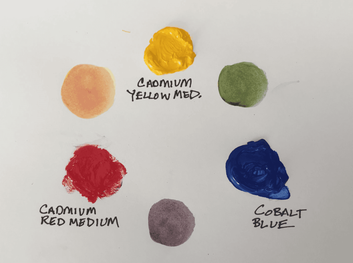
Limited Palette for Seascape Paintings

As an artist who primarily focuses on seascapes, I often opt for the primary triad palette. However, there are instances where I incorporate Cobalt Blue for the sky or utilize Ultramarine to achieve more intense violet-blues. You can explore some of my seascape paintings for reference.

For those interested in an alternative seascape palette, consider the following:

  • Transparent Yellow

This primary yellow pigment mixes harmoniously with cyan, allowing for the creation of captivating turquoises and teals.

  • Cadmium Yellow Light

With color coordinates leaning towards green, this variation of cadmium yellow is perfect for achieving sharp and clear greens when combined with the blues in this palette.

  • Alizarin Crimson

When mixed with blues, this color produces exquisite violet blues and violet blue-greys, making it an excellent choice for sunset sea paintings.

  • Cadmium Red Light

Mixing this pigment with yellow results in a muted orange shade that effectively neutralizes blues, thus creating a blue-grey palette.

  • Phthalo Blue

Arguably the most crucial color for seascapes, Phthalo Blue will be your go-to hue for various elements in your artwork.

  • Ultramarine Blue

By closely observing the sea, you’ll notice that light often plays upon it, imbuing it with purple undertones, particularly in deeper waters.

  • Ivory Black

In comparison to burnt umber, Ivory Black proves more effective when mixed with and darkening blues. Additionally, it helps in creating a range of muted blues.

Unleashing the Beauty of Limited Palettes in Landscape Painting

When it comes to landscape painting, your palette selection will depend on the specific landscapes and seasons you wish to capture. If you find yourself immersed in plein air painting during the summer, it’s essential to have colors that allow you to depict a variety of vibrant greens and bright flowers. In landscape painting, black is generally unnecessary, but burnt umber can help you achieve muted and earthy tones. Here, we present a limited palette tailored for landscapes:

  • Cadmium Yellow:

This slightly warm pigment exhibits a medium value akin to the color of butter. It works wonders for portraying summer flowers, fields of hay, and generating a sense of warmth in your artwork.

  • Transparent Yellow:

Use this color to create a multitude of shades in foliage. With its transparency, it delivers a clean and vibrant masstone, as well as brightness in tint.

  • Cadmium Red:

Reserved for warm sunsets and vibrant flowers, red is not a critical color in landscape painting. However, you can substitute other reds like Quinacridone Magenta or Vermilion if needed.

  • Alizarin Crimson:

As a transparent red that leans towards the blue spectrum, Alizarin Crimson is particularly effective in neutralizing greens in foliage or enhancing shadows in your landscape compositions.

  • Cobalt:

This slightly cool blue is an excellent choice for capturing skies, snow scenes, and lakes with its subtle brilliance.

  • Ultramarine:

With its warm undertones, Ultramarine is ideal for creating dark and greyish-green shades. It also lends itself well to deep lake scenes or intensely blue skies.

For those seeking additional options to facilitate mixing greens and deep earthy reds in their landscape paintings, consider these optional extras:

  • Burnt Sienna:

A staple for desert painters, Burnt Sienna works wonderfully in autumn scenes, forestry, and can even serve as an imprimatura for various subjects. It’s an incredibly vibrant earth pigment that can also serve as a substitute for red.

  • Sap Green:

This deep, earthy, and mossy transparent green leans towards yellow. While you can mix this color using your base palette, having a premixed tube of Sap Green can prove helpful during your painting process.

  • Yellow Ochre:

This beautiful pigment shines in golden sunsets and autumn landscapes, adding a touch of warmth to your compositions.

The Power of Limited Palettes in Landscape Painting

In this captivating gouache landscape painting, I ventured into the realm of limited palettes, utilizing just five colors in addition to ivory black, and white. To bring to life the golden grasses, rocky mountains, lush green bushes, and vibrant blue sky, I employed yellow ochre, viridian green, burnt umber, ultramarine, and cyan (alongside ivory black and titanium white). These colors are readily available in the Winsor & Newton gouache introductory set, but to fully embrace this palette, it is recommended to add individual tubes of titanium white and burnt umber. In the accompanying video tutorial, I delve into the various color-mixing techniques employed during the process.

Inspired by Monet’s Impressionist Palette

Claude Monet’s artwork is renowned for its brilliant colors and luminosity. He had a remarkable ability to perceive the subtle tones within the interplay of light and shadows in a landscape, which he then emphasized through vibrant color mixes. Monet’s achievement of vibrant hues can largely be attributed to his preference for a limited palette, allowing him to mix the fewest pigments together to achieve specific tones.

Monet’s palette typically included:

  • Cadmium Yellow Light (cool);
  • Cadmium Yellow Medium (warm);
  • Alizarin Crimson (cool and transparent);
  • Cadmium Red Light (warm);
  • French Ultramarine (cool);
  • Flake White.

Furthermore, it is suggested in James Heard’s book “Paint Like Monet” that Monet might have incorporated secondary green pigments, such as Viridian, to facilitate the mixing process in certain landscape pieces.

Exploring the Special Qualities of Extra Pigments

Certain pigments possess unique qualities that allow artists to achieve effects that cannot be easily replicated by mixing colors. In the context of a warm and cool palette consisting of six colors, you might find yourself lacking a suitable transparent deep red for glazing purposes. In such cases, incorporating a pigment like alizarin crimson can provide the desired effect.

The transparency, drying time, and even the binder used in pigments can significantly influence their usability and desirability in different artistic applications.

While many artists have gained fame for their mastery of limited palettes, such as Anders Zorn, it is important to recognize that their artistic practice was not always confined to such restrictions.

Evidence suggests that Zorn, as reported by the Museum Director of the Zorn Collection in Mora, Sweden, utilized a diverse range of colors throughout his painting career. Tubes of cobalt blue were discovered in his studio, and in certain paintings, it is evident that he employed a mixture of different blues and greens.

Therefore, while Zorn may have adhered to his limited palette for certain works, he also ventured beyond those boundaries on occasion.

Ultimately, the key is to experiment and discover what works best for your artistic practice, embracing the opportunity for exploration and, above all, enjoying the creative process.

FAQ

What does a limited palette mean?

A limited palette refers to using a restricted number of colors in a painting, typically fewer than the complete range of available pigments.

What is a limited palette called?

A limited palette is often called a “restricted palette” or a “reduced palette”.

What is limited color palette technique?

The limited color palette technique involves intentionally choosing a small number of colors to create a harmonious and cohesive visual effect in a painting.

What are the advantages of a limited color palette?

The advantages of a limited color palette include creating color harmony, simplifying color mixing, enhancing unity in a painting, and allowing artists to focus on value, composition, and other elements of their work.

Share

By

A Guide to the Best Fountain Pens for Drawing

Posted on 6 min read 71 views

The world of art is filled with a myriad of materials and mediums, from oil paints to digital tools. Amid this diverse palette, an unlikely hero emerges – the fountain pen. Not typically perceived as an instrument for creating masterpieces, it nonetheless holds a distinctive position due to its unique characteristics.

The fountain pen, with its capability to produce intricate details and fluid lines, serves as a crucial tool for many artists. Its classical charm adds an aesthetic appeal, making it more than just a writing instrument. For these artists, the fountain pen isn’t merely a tool, but a staple, enriching their craft and defining their style.

Pilot Falcon

AttributeOptions
PriceHigh
NibSoft Extra Fine, Soft Fine, Soft Medium, Soft Broad
Ink SystemCartridge, Converter

The Pilot Falcon, known for its semi-flexible gold nib, comes in several variations that artists will find intriguing. The nib has a unique feature – it offers a softness that allows the tines to spread slightly under pressure, creating line variation and enhancing the depth and texture of your drawings. This pen is excellent for expressive sketching and detailing.

Its rhodium-plated nib, in addition to providing an aesthetically pleasing contrast to its black body, offers a smooth writing experience that extends to drawing. The resin body is lightweight and comfortable to hold, making it a suitable choice for lengthy drawing sessions.

LAMY Safari

AttributeOptions
PriceMedium
NibExtra Fine, Fine, Medium, Broad, Left-handed
Ink SystemCartridge, Converter

The LAMY Safari, constructed of sturdy ABS plastic, is renowned for its ergonomic grip section designed to promote proper holding technique. This is especially useful for artists who require stability and precision in their work.

The pen’s nib, available in various sizes, is easily interchangeable, allowing artists to switch between line widths conveniently. Its sturdy build and smooth ink flow make it an ideal companion for the artist who is on the go.

TWSBI ECO

AttributeOptions
PriceLow
NibExtra Fine, Fine, Medium, Broad, Stub 1.1
Ink SystemPiston Filler

The TWSBI ECO is a demonstration of beauty meeting functionality at an affordable price. This pen features a piston filler system, which is not commonly found in this price range. This system allows for a larger ink capacity, enabling prolonged drawing sessions without frequent refills.

Its transparent body provides a visually pleasing glimpse into the pen’s inner workings and offers a clear indication of when a refill is due. The stainless steel nib provides a reliably consistent ink flow, beneficial for maintaining continuity in your drawings.

Platinum #3776 Century

AttributeOptions
PriceHigh
NibUltra Extra Fine, Extra Fine, Fine, Medium, Broad, Coarse, Music
Ink SystemCartridge, Converter

The Platinum #3776 Century is a premium fountain pen that makes its mark with its “Slip and Seal” mechanism. This mechanism ensures the pen won’t dry out for up to two years, even when left unused. This feature is particularly helpful for artists who use their fountain pen sporadically.

The pen’s nib sizes range from Ultra Extra Fine to Coarse, offering a great deal of versatility in line widths. Particularly noteworthy is the Ultra Extra Fine nib, which allows for a level of detail not achievable with many other fountain pens.

Sailor 1911 Standard

AttributeOptions
PriceHigh
NibExtra Fine, Fine, Medium Fine, Medium, Broad, Zoom, Music
Ink SystemCartridge, Converter

Sailor, a respected name in the fountain pen industry, does not disappoint with the 1911 Standard. Its range of nib options – Extra Fine to Broad, along with Zoom and Music nibs – ensures a fit for every artist’s preference.

The Zoom nib is unique. When used at a higher angle, it gives a fine line suitable for detail work. As you lower the angle, the line becomes broader, allowing for effective shading or bold lines.

Choosing Your Fountain Pen Ink for Drawing

Close-up photo of a fountain pen focused on the tip

When it comes to drawing with fountain pens, selecting the right ink is crucial. Different inks offer a variety of properties that can greatly impact your drawing experience. From waterproofness to sheen and fade-resistance, understanding the characteristics of various inks will help you make an informed decision.

To assist you in your ink selection process, here are a few popular inks that many artists consider:

Sailor Kiwa-Guro

  • Smooth flow: Sailor Kiwa-Guro is highly regarded for its smooth flow, allowing for seamless drawing;
  • Waterproof: This ink is specifically known for its waterproof properties, ensuring that your artwork remains intact even when exposed to moisture.

Platinum Carbon Black

  • Deep black color: Platinum Carbon Black offers a rich and deep black color, providing a bold and dramatic effect to your drawings;
  • Permanence: This ink is renowned for its permanence, meaning it is resistant to fading over time, preserving the integrity of your artwork.

Diamine Ancient Copper

  • Color range and shading: Diamine Ancient Copper is a popular choice for artists due to its extensive range of color and shading possibilities. It offers a warm and inviting copper hue that can add depth and dimension to your drawings.

Remember, not all fountain pen inks are created equal. It’s crucial to ensure that the ink you choose is compatible with your specific fountain pen. Some inks may contain particles or components that could potentially clog the pen’s feed, leading to issues with ink flow and performance. Always verify that the ink you select is suitable for your particular pen to avoid any complications.

By considering the properties and characteristics of different fountain pen inks, you can find the perfect ink that aligns with your artistic vision and requirements. Experimenting with various inks will allow you to explore different effects and enhance your drawing experience with fountain pens.

Decoding Nib Types: A Detailed Look

Photo of a hand writing in a writing pad using a fountain pen

For many artists, the fountain pen’s allure lies in the nib – its heart, its soul. The nib determines the line width, the feel on paper, and the overall drawing experience.

Understanding the various nib types can guide artists in choosing the perfect pen:

  • Extra Fine/Fine (EF/F): These nibs provide thin lines, excellent for precision work or intricate detailing. However, they may offer a slightly scratchy feel due to the thinness of the tines;
  • Medium/Broad (M/B): These nibs provide wider lines and a smoother writing experience. They are great for larger illustrations or pieces that require bold lines and shading;
  • Stub/Italic (S/I): These nibs, cut straight across, offer unique line variation. Depending on the stroke direction, you can achieve thin or thick lines, adding character to your drawings;
  • Flex (F): Flex nibs can provide thin to broad lines within a single stroke, depending on the applied pressure. They add a certain dynamic expressiveness to sketches, although they may require a bit more practice to use effectively;
  • Zoom/Music (Z/M): These are special nibs that provide significant line variation based on the pen’s angle. They are versatile and can be used for both detailed and bold artwork.

Conclusion

The art world is as vast as it is diverse, offering an array of tools for artists to express their creativity. The fountain pen, while a more traditional choice, is rich with potential and versatility. With various nib options, ink types, and price ranges, there’s a fountain pen to suit every artist’s style and budget. As you embark on your artistic journey with fountain pens, remember to explore, experiment, and most importantly, enjoy the process. After all, the fountain pen is not merely a tool; it is an extension of the artist’s hand and a vehicle for bringing imagination to life.

FAQS

Which fountain pen is best for drawing?

The “best” fountain pen for drawing depends on your specific requirements, such as the level of detail in your drawings, your budget, and personal comfort. However, Pilot Falcon and LAMY Safari are two excellent options for their versatility and control.

Is fountain pen ink good for drawing?

Yes, fountain pen ink is great for drawing. It offers a range of color options and different properties such as permanence, shading, and sheening. However, it’s essential to ensure the ink is compatible with the fountain pen to prevent clogging or other damages.

What nib is best for drawing?

The choice of the nib depends on your drawing style. Extra fine or fine nibs are best for detailed work, while broad or stub nibs are great for bold lines and shading. Flex nibs allow varying line width in a single stroke, adding character and dynamism to your sketches.

What are the best fountain pen nibs for sketching?

For sketching, flex, stub, or music nibs are often preferred due to the varying line widths they provide. However, it ultimately comes down to the artist’s preference and style.

Share

By

Delving Deep into Warm Colors in the Canvas of Art

Posted on 8 min read 73 views

Art has perpetually served as a channel for individuals to express themselves, transforming the intangible into tangible creations. Among the fundamental elements that constitute art, color goes beyond being merely a visual attribute. It possesses the ability to communicate emotions, weave narratives, and breathe life into artistic endeavors. Amidst the vast array of shades and tones, warm colors hold a distinct significance owing to their innate capacity to evoke a diverse range of emotions. From providing solace and coziness to igniting passion and aggression, these hues wield a powerful influence. This comprehensive exploration delves deep into the role, comprehension, and application of warm colors within the realm of art.

Understanding Warm Colors

Warm colors are colors that, when visualized, evoke feelings of warmth, just like a sunny day or a cozy fireplace. They reside on one half of the color wheel and encompass hues from red through yellow, browns and tans included.

Color Wheel and Warm Colors

The color wheel is a fundamental tool used in the field of art and design to help understand the relationships between different colors. It consists of a circular diagram that organizes colors in a logical and visually appealing manner. The color wheel is divided into different sections, each representing specific color groups or categories.

Warm colors are a prominent category on the color wheel, and they evoke feelings of warmth, energy, and vibrancy. These colors are often associated with fire, sunlight, and heat. The warm colors on the color wheel include red, orange, and yellow. Additionally, there are some tertiary colors that also fall under the category of warm colors due to their composition.

To provide a clearer understanding, let’s explore the warm colors on the color wheel:

The color wheel is divided into several sections, including primary colors, secondary colors, and tertiary colors. Each section represents a specific set of colors. In the context of warm colors, the relevant sections are as follows:

ColorDescriptionPosition on Color Wheel
Primary Colors
RedA vibrant and intense color often associated with passion, love, and power.12 o’clock
YellowA bright and cheerful color symbolizing happiness, energy, and sunlight.4 o’clock
Secondary Colors
OrangeA warm and energetic color created by mixing red and yellow.Between red and yellow
Tertiary Colors
Red-VioletA tertiary color that combines red and violet hues.Between red and violet
Yellow-GreenAnother tertiary color formed by mixing yellow and green.Between yellow and green

Warm colors play a crucial role in art and design as they can create a sense of depth, energy, and excitement. They are often used to draw attention, convey strong emotions, or create a lively atmosphere. The positioning of warm colors on the color wheel helps artists and designers choose color combinations that harmonize well and create a visually appealing composition.

When using warm colors, it is essential to consider their effects on the overall design or artwork. They can be used to highlight specific elements, create focal points, or evoke specific moods. Combining warm colors with complementary cool colors can create a balanced and visually striking composition.

Warm Color Properties

Warm colors possess distinct properties that define their visual characteristics and emotional impact. Understanding these properties is essential for artists and designers to effectively utilize warm colors in their work. Here are some key properties of warm colors:

PropertyDescription
IntensityWarm colors are perceived as more intense compared to cool colors. They possess vibrancy and brightness that make them visually striking and captivating. The high intensity of warm colors allows them to grab attention and create a focal point within an artwork or design. Artists can utilize this property to draw the viewer’s gaze to specific areas or elements they want to emphasize.
Depth PerceptionWarm colors have the ability to create an illusion of depth in an artwork. When warm colors are used prominently or in the foreground of a composition, they tend to appear closer to the viewer. This visual effect enhances the three-dimensionality of an artwork, making it appear more dynamic and engaging. Artists can strategically place warm colors to manipulate the perception of depth and guide the viewer’s gaze within the composition.
Mood EvocationWarm colors have a powerful impact on evoking specific emotions and moods. They are often associated with warmth, comfort, passion, and joy. When used in a composition, warm colors can create a sense of energy and enthusiasm, making it feel lively and inviting. However, warm colors can also evoke more intense emotions like aggression or anger when used in certain contexts. Artists can carefully select warm colors to align with the desired mood or atmosphere of their artwork, effectively conveying the intended emotions to the viewer.

Incorporating warm colors into an artwork requires careful consideration of these properties. By understanding the intensity, depth perception, and mood-evoking capabilities of warm colors, artists can make deliberate choices that enhance the overall impact and visual storytelling of their creations.

To summarize, warm colors possess unique properties that distinguish them from cool colors. Their high intensity grabs attention, their placement can create depth perception, and their ability to evoke specific moods allows artists to convey various emotions. By harnessing these properties, artists can effectively employ warm colors in their work and create visually appealing and emotionally resonant compositions.

Application of Warm Colors in Art

Color wheel with warm tones on one side, with a picture of an erupting volcano

Warm colors play a significant role in the realm of art, offering artists a range of applications to convey emotions, highlight objects, or create a specific ambiance within their works. Here are several notable applications of warm colors in art:

  1. Creating a Sense of Warmth and Comfort: Warm colors are often employed to represent elements such as sunlight, fire, or warmth itself. By incorporating warm colors like shades of red, orange, and yellow, artists can evoke a feeling of coziness and comfort in their artworks. These colors can create an inviting atmosphere, making viewers feel a sense of warmth and familiarity;
  2. Evoking Emotions: One of the key strengths of warm colors lies in their ability to elicit specific emotions. Artists frequently harness the emotive capacity of warm colors to stimulate feelings of happiness, optimism, energy, and passion in their audience. The vibrant and lively nature of warm colors enables artists to imbue their artworks with a sense of vitality and enthusiasm;
  3. Highlighting Elements: Warm colors possess an inherent vibrancy and brightness, which makes them effective in drawing attention to specific elements within an artwork. By strategically utilizing warm colors, artists can emphasize particular objects or subjects, creating focal points that guide the viewer’s gaze. This technique allows for the selective highlighting of significant elements, enhancing their visual impact and importance in the composition;
  4. Creating Depth: The perception of warm colors as closer to the viewer can be leveraged to create a sense of depth and three-dimensionality in paintings. When warm colors are placed in the foreground or prominently featured in a composition, they appear to be closer, while cooler colors recede into the background. This visual effect enhances the illusion of depth, making the artwork feel more dynamic and immersive.

Warm colors find diverse applications in art. They can create a sense of warmth and comfort, evoke specific emotions, highlight elements, and contribute to the perception of depth within an artwork. By skillfully incorporating warm colors into their compositions, artists can effectively communicate their desired emotions and create visually engaging and impactful artworks.

Historical Use of Warm Colors in Art

Throughout different periods of art history, warm colors have been applied in unique and distinctive ways, contributing to the development and expression of artistic movements. Here are notable examples of the historical use of warm colors in art:

  • Renaissance: During the Renaissance, artists sought to imitate nature and create lifelike, naturalistic paintings. Warm hues were used extensively to achieve this goal. Artists such as Leonardo da Vinci employed warm colors in their chiaroscuro technique, which involved the dramatic use of light and shadow to create depth and three-dimensionality in their artworks. By skillfully manipulating warm colors, Renaissance artists were able to render the warmth and richness of human flesh, textiles, and other natural elements;
  • Impressionism: Impressionist artists, including Claude Monet and Pierre-Auguste Renoir, revolutionized the use of color in art. They extensively utilized warm colors to capture the changing effects of light and color in nature. Warm hues like vibrant oranges, yellows, and reds were employed to depict the warm sunlight, shimmering reflections, and the overall atmospheric ambiance in their outdoor landscapes. The application of warm colors in Impressionism contributed to the creation of vibrant and lively scenes that conveyed a sense of immediacy and captured fleeting moments;
  • Expressionism: In the Expressionist movement, artists aimed to convey intense emotions and subjective experiences. Warm colors played a significant role in communicating these emotional states. Artists like Edvard Munch, known for his iconic painting “The Scream,” utilized warm hues to heighten the sense of anxiety, terror, and emotional turmoil depicted in the artwork. The bold and intense application of warm colors, such as fiery reds and oranges, evoked a visceral response and intensified the emotional impact of the composition.

The historical use of warm colors in art demonstrates their versatility and power to evoke specific moods, create depth, and convey emotional intensity. From the naturalistic approach of the Renaissance to the expressive qualities of Impressionism and Expressionism, warm colors have played a vital role in shaping artistic movements and enriching the visual language of art.

Conclusion

Warm colors play an instrumental role in art, creating visceral responses, setting the tone, and crafting the visual narrative. Their ubiquitous presence across art history testifies to their enduring appeal and significance in the artist’s toolkit. By mastering the use of warm colors, artists can turn their canvases into a vibrant stage where colors perform a symphony of emotions and meanings, transforming their artworks into resonant pieces that connect with the viewers on a deeper level. Understanding the intricacies of warm colors paves the way for artistic innovation, pushing the boundaries of creativity and revealing the extraordinary power of color in art.

FAQS

What is a warm colors definition?

Warm colors are the colors that, when visualized, evoke feelings of warmth, like a sunny day or a cozy fireplace. They consist of hues from red through yellow, with browns and tans often being included.

What are warm and cool colors in art?

Warm colors range from red through yellow and include browns and tans, invoking feelings of warmth and comfort, while cool colors include hues from blue-green through blue-violet, often associated with calmness, tranquility, and space.

Understanding the distinct attributes and the emotive power of warm colors can enrich an artist’s practice, providing them with a broader palette of expressive possibilities. By harnessing their potential, artists can construct more impactful narratives, engage the viewer’s senses more profoundly, and bring their creative vision to life more effectively.

Share

By

Paint Brush Storage: Preserving Quality

Posted on 8 min read 48 views

In the realm of both professional painting and DIY creative projects, paint brushes serve as an indispensable tool. Their utility, however, extends far beyond the strokes they render on a canvas or wall. The longevity and performance of these brushes heavily depend on how they are stored and cared for. This comprehensive guide dives into the essential methods for storing and preserving your paint brushes, providing you with valuable insights on how to maintain their quality over time and secure optimal performance in all your painting endeavors.

To help you fully grasp the importance of proper paint brush storage, this guide also walks you through the different parts that make up a paint brush. This understanding allows you to better comprehend why certain storage techniques can benefit or potentially harm your brushes. From the anatomy of a paint brush to storing them between coats, without cleaning, or when not in use, we’ll cover the details of preserving your tools for the perfect stroke. So, let’s delve into the intricate world of paint brush storage and learn how to safeguard our artistic companions for an extended lifespan.

Understanding the Parts of a Paint Brush

To properly care for and store paint brushes, it is essential to have a good understanding of the different parts that make up a paint brush. By familiarizing yourself with these components, you can better appreciate why certain storage methods can potentially harm your brushes. Let’s take a closer look at each part:

  • Handle: The handle of a paint brush is typically made of wood or plastic and serves as the area where you grip the brush. It provides stability and control while you’re paintin;
  • Ferrule: The ferrule is the metal part of the paint brush that attaches the bristles to the handle. It is usually made of aluminum, nickel, or brass. The ferrule holds the bristles securely in place, ensuring that they remain intact and don’t fall out during use;
  • Crimp: The crimp refers to the part of the ferrule that is pinched or crimped to hold it firmly onto the handle. This tightens the connection between the ferrule and the handle, providing added stability to the brush;
  • Heel: The heel is the part of the bristles that sits directly inside the ferrule. It is the area where the bristles meet the ferrule and is crucial for maintaining the brush’s shape and integrity;
  • Toe: The toe of the brush refers to the tips of the bristles. These are the fine, delicate ends that come into contact with the painting surface. The quality and condition of the toe greatly affect the precision and control you have while painting;
  • Belly: The belly is the middle part of the bristles, which is responsible for holding the majority of the paint. It is the thickest and most voluminous part of the brush, allowing it to carry and distribute paint smoothly and evenly.

By understanding the different parts of a paint brush, you can realize why proper storage is essential. For instance, storing brushes upright or in a brush holder can help protect the toe and prevent the bristles from bending or fraying. Avoiding excessive pressure on the bristles, especially the delicate toe, can prolong the lifespan of your brushes and ensure optimal performance.

Knowing the various parts of a paint brush enables you to appreciate the significance of proper storage methods. By handling and storing your brushes with care, you can extend their longevity and maintain their functionality, allowing for continued artistic expression.

How to Store Brushes Between Coats

When you’re in the midst of a painting project and need to take a break between coats, it’s important to store your brushes properly to prevent the paint from drying and damaging the bristles. Follow these steps to ensure your brushes stay in good condition during the waiting period:

  1. Wipe Off Excess Paint: Before storing your brushes, gently wipe off any excess paint using a rag or a piece of newspaper. This step helps remove the majority of the paint from the bristles, minimizing the risk of it drying and hardening on the brush;
  2. Wrap the Brush: To protect the bristles from air exposure, take a piece of plastic wrap, wax paper, or aluminum foil and wrap it tightly around the bristles. This wrapping creates a barrier that prevents air from reaching the paint, keeping it moist for a longer period;
  3. Store the Brush Properly: Find a cool and dry area to store your wrapped brush. Heat and moisture can affect the drying process of the paint and may cause damage to the brush. It’s important to keep the brush away from direct sunlight or sources of heat;
  4. Choose the Right Position: When placing the brush in storage, make sure it is stored flat or slightly tilted with the bristles facing downwards. This positioning helps prevent paint from seeping into the ferrule, the metal part that holds the bristles, which can lead to bristle damage and affect the brush’s performance.

By following these guidelines, you can ensure that your brushes remain in good condition during the break between coats. Proper storage practices contribute to the longevity of your brushes and maintain their effectiveness for future painting projects.

StepToolAction
1Rag/NewspaperWipe off excess paint
2Plastic wrap/Wax paper/Aluminum foilWrap bristles tightly
3N/AStore in cool, dry place

Storing Brushes Without Cleaning

In certain situations, you may find yourself needing to take a break from painting without having the opportunity to clean your brushes immediately. While it’s always best to clean your brushes promptly, there are steps you can take to store them temporarily and prevent the paint from drying on the bristles. Here’s a detailed guide on how to store your brushes without cleaning them right away:

  • Remove Excess Paint: Start by wiping off as much paint as possible from the bristles using a rag or paper towel. This step helps remove the bulk of the paint and prevents it from drying and hardening on the brush;
  • Submerge the Bristles: Find a jar or brush holder and fill it with water if you were using latex paint or the appropriate solvent if you were using oil-based paint. Submerge the bristles of the brush in the water or solvent, ensuring that the liquid covers the bristles without touching the ferrule. This immersion helps keep the paint moist and prevents it from drying out;
  • Cover the Holder: Loosely cover the jar or brush holder to limit the exposure of the brushes to air. While it’s important to reduce air circulation to slow down the drying process, some ventilation is still necessary to prevent the growth of mold or mildew. Use a loosely fitting lid or cover that allows for a small amount of air exchange;
  • Check and Maintain: It’s essential to periodically check the level of water or solvent in the container. If the liquid evaporates over time, add more to ensure that the bristles remain submerged. This helps maintain the paint’s moisture and prevents it from drying on the brush.

It’s important to note that this method is only a temporary solution. It’s crucial to clean your brushes as soon as possible to prevent the paint from hardening and causing permanent damage. The steps outlined above are intended to keep the paint wet and allow for temporary storage until you can thoroughly clean your brushes.

StepToolAction
1Rag/Paper towelWipe off excess paint
2Jar/Brush holderSubmerge bristles in water or solvent
3Lid/ClothCover holder loosely

Storing Brushes When Not in Use

Photo of a hand arranging paint brushes in a paint brush organizer

Properly storing your paint brushes when they are not in use is crucial for maintaining their quality and longevity. By following the steps below, you can ensure that your brushes remain in excellent condition and are ready for your next painting project:

  • Dry Them Properly: After cleaning your brushes, gently pat them dry with a towel. Avoid pulling on the bristles, as this can cause them to loosen or become misshapen. To allow for proper drying, lay the brushes flat on a clean surface or hang them bristles-down from a brush holder. This allows any excess moisture to evaporate and ensures that the brushes dry thoroughly;
  • Reshape the Bristles: Once your brushes are completely dry, it’s important to reshape the bristles into their original form. Use your fingers to gently mold the bristles back into the shape they were when the brush was new. This step helps prevent the bristles from fanning out or bending, ensuring optimal performance and a smooth application in your next painting session;
  • Use Protective Covers: If your brushes come with protective covers or caps, make sure to put them back on. These covers help maintain the shape and integrity of the bristles and protect them from dust, dirt, and other particles that could adhere to the bristles. If you don’t have the original covers, consider purchasing brush protectors or improvised solutions such as wrapping the bristles in a clean cloth or using breathable brush sleeves;
  • Store Correctly: Choosing the right storage location is essential for preserving the quality of your brushes. Store them in a cool and dry place, away from direct sunlight, as exposure to sunlight can warp the handles and fade the bristles. If possible, store the brushes horizontally or vertically with the bristles facing up. This positioning helps maintain the shape of the bristles and prevents them from becoming deformed. Avoid storing brushes with the bristles facing down, as this can result in an uneven distribution of bristle hairs, leading to inconsistent paint application.
StepToolAction
1TowelPat brushes dry
2N/AReshape bristles
3Brush protectorsCover bristles
4N/AStore in cool, dry place

Conclusion

Proper storage of paint brushes plays a crucial role in preserving their longevity and performance. By implementing these best practices in your routine, such as thoroughly cleaning brushes after use, storing them appropriately between coats, and ensuring they are kept in optimal conditions when not in use, you are making a valuable investment. This not only enhances your painting results but also saves you from frequently replacing your tools. Remember, a well-cared-for brush is a painter’s best ally for achieving a flawless finish.

FAQS

What is the correct way to store paint brushes?

After use, brushes should be thoroughly cleaned, then dried and reshaped. They should be stored in a cool, dry place, either flat or bristles-up. Covers or protectors can be used to preserve the shape of the bristles.

How do you keep paint brushes from drying out between coats?

To prevent brushes from drying out between coats, remove excess paint, then wrap them in plastic wrap or aluminum foil. Store the wrapped brushes in a cool, dry place.

How do you store paint brushes without cleaning them?

If you need to store brushes without cleaning them, wipe off excess paint, then place them in a brush holder with the bristles submerged in water or the appropriate solvent. Loosely cover the holder to limit air exposure.

How should paint brushes be stored when they are not in use and why is that important?

When not in use, brushes should be stored clean and dry, with the bristles reshaped and covered, in a cool, dry place. This is important because improper storage can cause bristles to bend, fan out, or become loaded with dust, affecting their painting performance.

Share

By

The World of Color: The Best Oil Pastels

Posted on 4 min read 52 views

Embarking on a captivating journey into the enchanting realm of artistic expression is an exhilarating endeavor. Among the cherished tools cherished by countless creative souls, oil pastels hold a special place, infusing their masterpieces with an unmatched vitality and tactility. Within the following discourse, we shall navigate through a selection of the finest oil pastels presently obtainable in the market, all while delving into crucial inquiries pertaining to this remarkable medium.

Oil Pastels: An Art Medium to Explore

The first invention of oil pastels dates back to the early 20th century, when Kanae Yamamoto, a Japanese artist, desired a crayon that could draw with more precision than traditional materials. In collaboration with Sakura Color Products Corporation, he invented Cray-Pas, setting the stage for modern oil pastels.

The beauty of oil pastels lies in their intense colors, blendability, and the creamy texture they leave on the canvas.

Features of Good Oil Pastels

An excellent oil pastel possesses the following features:

  • Intensity of Color: High-quality oil pastels are dense with pigments, providing strong, vibrant colors;
  • Blendability: Good oil pastels should blend smoothly, producing a wide range of hues and tonal effects;
  • Consistency and Texture: The texture of the oil pastel should be buttery and creamy, allowing for easy layering and application.

Top Brands in Oil Pastels

Here are some of the best oil pastel brands available on the market:

  1. Sennelier: Renowned as a premier fine art brand, Sennelier offers artist-grade oil pastels that are smooth and highly pigmented. They are also extremely lightfast, ensuring the longevity of your artwork;
  2. Holbein: Holbein’s Artist series of oil pastels are superb in their intensity of color and durability. They have a fantastic range of colors, offering over 225 individual shades;
  3. Mungyo Gallery: Mungyo Gallery Soft Oil Pastels are popular for their high pigment content and excellent blendability. These pastels are also very reasonably priced, making them accessible to both professionals and beginners alike;
  4. Van Gogh: Van Gogh Oil Pastels are notable for their vivid colors and easy application. They offer a decent range of colors at a moderate price.

Oil Pastels for Beginners

If you are a novice to the world of oil pastels, you might be seeking a set that is affordable but still delivers on quality. The Pentel Arts Oil Pastels could be an excellent choice. They are budget-friendly, yet provide bright, vivid colors with a smooth texture. Another good choice for beginners is the Cray-Pas Junior Artist Oil Pastels. This set is not only affordable, but it is also easy to use and offers an impressive range of colors.

Soft Pastels vs Oil Pastels: The Difference

Photo of oil pastels neatly arranged inside their box

While both soft and oil pastels offer vibrant colors and unique textures, they differ in a few key ways:

  • Composition: Soft pastels are made from pure pigment mixed with a small amount of binder, while oil pastels combine pigments with non-drying oil and wax;
  • Blendability: Oil pastels blend smoothly due to the oil content, creating a painting-like texture. Soft pastels, on the other hand, have a more chalky texture, but can also be blended;
  • Fixatives: Soft pastels require a fixative to prevent smudging, whereas oil pastels are smudge-resistant due to their oil and wax content.

The Price-Quality Spectrum

When comparing cheap and expensive oil pastels, the difference usually lies in the quality of pigments, consistency, and lightfastness. Expensive oil pastels tend to have higher pigment concentrations, yielding brighter colors and better blendability. They are also more resistant to the fading effects of light, ensuring the longevity of your artwork. Cheaper alternatives may provide less vibrancy and may fade or change color over time. However, they can still be a good choice for beginners or for those seeking to practice techniques.

Conclusion

Whether you are a seasoned artist or a beginner stepping into the world of color, oil pastels are an exciting medium to explore. The brand you choose ultimately depends on your needs, preferences, and budget. Regardless, every brand offers a unique set of characteristics that can elevate your artistry to new heights. So, pick up those vibrant sticks of color and start creating!

FAQS

Which is the best oil pastel brand?

While the “best” brand can be subjective and depends on an artist’s personal preferences, Sennelier is often revered as one of the top brands for oil pastels due to their high pigment concentration, blendability, and durability.

Which is the best oil pastel for beginners?

Pentel Arts Oil Pastels and Cray-Pas Junior Artist Oil Pastels are excellent choices for beginners due to their affordability, ease of use, and quality.

Is there a difference between soft pastels and oil pastels?

Yes, there is a difference. Soft pastels are made from pure pigment mixed with a small amount of binder, producing a chalky texture. Oil pastels, on the other hand, combine pigments with non-drying oil and wax, resulting in a creamy texture and painting-like effect.

What is the difference between cheap and expensive oil pastels?

Expensive oil pastels typically have higher pigment concentrations, better blendability, and are more resistant to the fading effects of light. Cheap oil pastels may not offer the same vibrancy and longevity, but can still be suitable for beginners or practice work.

Share

By

Elevate Your Creations: Discover the Finest Chalk Paints

Posted on 5 min read 72 views

Chalk paint has become a favorite among DIY enthusiasts and furniture upcycles, thanks to its exceptional properties and versatility. In this all-encompassing guide, we will embark on a journey into the realm of chalk paint, delving into its unique characteristics, wide-ranging benefits, and expert application techniques. Furthermore, we will unveil a comprehensive selection of the finest chalk paints currently available in the market, highlighting their standout features, extensive color ranges, impressive durability, and valuable user feedback. Whether you’re an experienced furniture restorer or a novice seeking to breathe new life into your pieces, this article will serve as your ultimate go-to resource for selecting the perfect chalk paint to bring your creative visions to fruition.

Characteristics and Benefits of Chalk Paint

Chalk paint has taken the DIY world by storm, offering a versatile and user-friendly option for transforming furniture and home decor. With its unique characteristics and numerous benefits, chalk paint has become a popular choice among creative enthusiasts. In this article, we will explore the characteristics and benefits of chalk paint, highlighting why it has become a go-to option for revamping and upcycling projects.

  • Matte Finish

One of the defining characteristics of chalk paint is its velvety matte finish. Unlike traditional glossy paints, chalk paint dries to a soft, chalky texture, creating a vintage or shabby chic aesthetic. This finish adds a touch of elegance and a unique charm to furniture and decor pieces, making them stand out with their understated beauty.

  • Adherence to Various Surfaces
Room with colorful table and chairs, painted in chalk paint

With its remarkable adherence, chalk paint showcases exceptional versatility by seamlessly adhering to a diverse array of surfaces. Whether it’s wood, metal, glass, plastic, or even fabric, chalk paint effortlessly transforms various items, from dressers and tables to jars and picture frames. The beauty of chalk paint lies in its ability to eliminate the need for extensive surface preparation. By simply ensuring cleanliness and minimal sanding, you can directly apply chalk paint to most surfaces, resulting in a time-saving and effortless painting process.

  • Minimal Prep Work

One of the major advantages of chalk paint is its ability to minimize the amount of prep work required. Unlike other paints that often necessitate extensive sanding, priming, and stripping, chalk paint can be applied directly to most surfaces with little to no prep work. This characteristic not only saves time and energy but also makes it an ideal option for beginners or those seeking a hassle-free painting experience.

  • Distressing and Layering

Chalk paint lends itself exceptionally well to distressing techniques, allowing you to create an aged or weathered appearance. By gently sanding the painted surface or using a damp cloth, you can reveal underlying layers of paint, wood, or texture, adding depth and character to your creations. This characteristic gives you the freedom to experiment with different distressing methods and achieve a customized, vintage look.

  • Customizable Colors

Chalk paint offers a vast array of colors, from muted neutrals to vibrant hues, allowing you to bring your creative vision to life. Additionally, chalk paint can be easily mixed, enabling you to create custom shades and achieve the precise color palette you desire. This versatility ensures that your projects reflect your personal style and seamlessly integrate into your existing decor.

  • Ease of Use and Quick Drying Time

Chalk paint’s user-friendly nature makes it accessible to both experienced painters and beginners alike. Its thick consistency provides excellent coverage, allowing for smooth and easy application. Moreover, chalk paint has a relatively quick drying time, which means you can move on to the next steps or apply additional layers sooner, reducing overall project time.

  • Minimal Odor and Easy Cleanup

Compared to traditional solvent-based paints, chalk paint is known for its low odor. This makes it suitable for indoor use, eliminating the need for well-ventilated areas or exposure to harsh fumes. Additionally, cleanup is a breeze with chalk paint, as it typically requires only soap and water, making it a convenient choice for those who prefer a hassle-free cleanup process.

Factors to Consider When Choosing Chalk Paint

A can of chalked blue paint on the chair
  • Brand Reputation and Quality

The reputation and quality of the chalk paint brand play a crucial role in ensuring a satisfactory painting experience. Research different brands, read customer reviews, and consider factors such as the brand’s history, customer satisfaction, and professional recommendations. Opting for established and reputable brands will likely guarantee a high-quality product that delivers consistent results.

  • Color Range and Availability

One of the appeals of chalk paint is its vast color palette, allowing you to unleash your creativity and match your desired aesthetic. Consider brands that offer a wide range of colors, including popular and trendy shades, as well as timeless classics. Additionally, check the availability of the colors you desire, ensuring they are easily accessible when you need to restock or expand your collection.

  • Paint Consistency and Coverage

The consistency and coverage of chalk paint can significantly impact the ease of application and the final result. Look for a paint with a smooth and creamy consistency, as it will glide effortlessly onto surfaces and minimize brush strokes. Consider paints that provide good coverage with fewer coats, saving you time and effort. Testing samples or reading user experiences can help you determine which brands offer superior consistency and coverage.

  • Durability and Longevity

When investing time and effort into a DIY project, you want the results to last. Evaluate the durability and longevity of the chalk paint options you are considering. Factors such as resistance to chipping, fading, and wear will ensure that your painted pieces remain vibrant and beautiful over time. Look for paints that are specifically formulated for furniture and offer long-lasting results.

  • Eco-Friendliness and Safety

For environmentally-conscious individuals, considering the eco-friendliness and safety of chalk paint is essential. Look for brands that offer low or zero VOC (volatile organic compounds) formulations, indicating that they have fewer harmful chemicals. Water-based paints are often a more eco-friendly choice compared to solvent-based alternatives. Prioritizing paints that are safe to use indoors, without strong odors or toxic fumes, will ensure a pleasant and healthy painting experience.

Conclusion

In conclusion, selecting the best chalk paint for your furniture renovation projects requires careful consideration of various factors such as brand reputation, color range, coverage, durability, and safety. While brands like Annie Sloan, Rust-Oleum, FolkArt, DecoArt, and Dixie Belle have proven their excellence in the market, other notable brands also offer impressive options. By understanding the characteristics and techniques associated with chalk paint application, you can achieve stunning results and breathe new life into your furniture pieces. Remember to experiment, explore different methods, and enjoy the creative process as you embark on your chalk paint journey.

Share

By