Art has perpetually served as a channel for individuals to express themselves, transforming the intangible into tangible creations. Among the fundamental elements that constitute art, color goes beyond being merely a visual attribute. It possesses the ability to communicate emotions, weave narratives, and breathe life into artistic endeavors. Amidst the vast array of shades and tones, warm colors hold a distinct significance owing to their innate capacity to evoke a diverse range of emotions. From providing solace and coziness to igniting passion and aggression, these hues wield a powerful influence. This comprehensive exploration delves deep into the role, comprehension, and application of warm colors within the realm of art.
Understanding Warm Colors
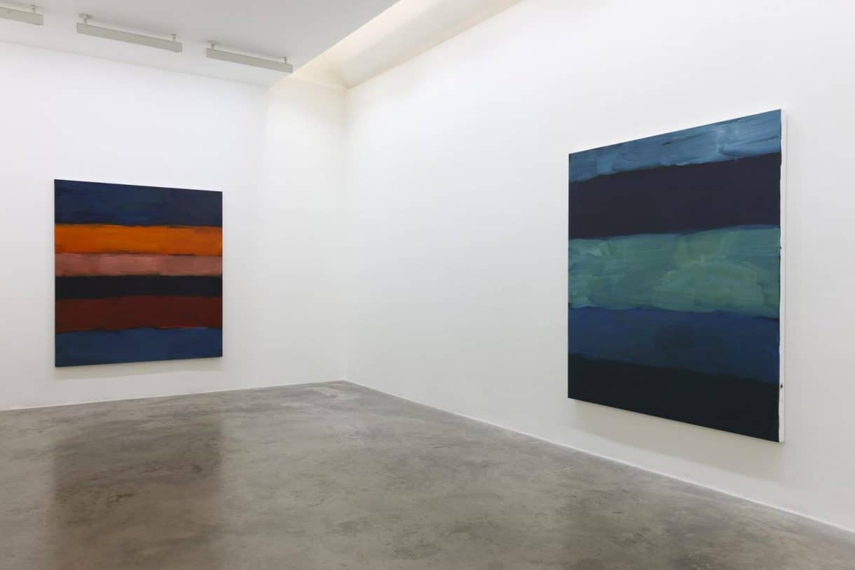
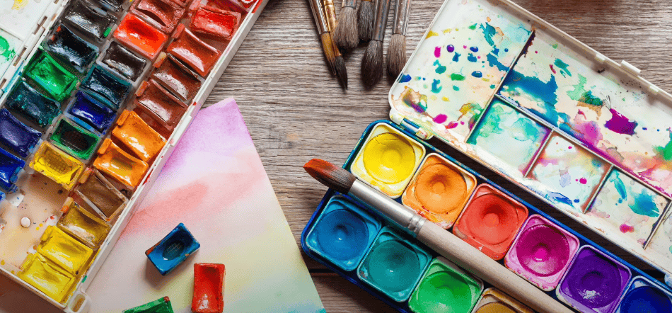
Warm colors are colors that, when visualized, evoke feelings of warmth, just like a sunny day or a cozy fireplace. They reside on one half of the color wheel and encompass hues from red through yellow, browns and tans included.
Color Wheel and Warm Colors
The color wheel is a fundamental tool used in the field of art and design to help understand the relationships between different colors. It consists of a circular diagram that organizes colors in a logical and visually appealing manner. The color wheel is divided into different sections, each representing specific color groups or categories.
Warm colors are a prominent category on the color wheel, and they evoke feelings of warmth, energy, and vibrancy. These colors are often associated with fire, sunlight, and heat. The warm colors on the color wheel include red, orange, and yellow. Additionally, there are some tertiary colors that also fall under the category of warm colors due to their composition.
To provide a clearer understanding, let’s explore the warm colors on the color wheel:
The color wheel is divided into several sections, including primary colors, secondary colors, and tertiary colors. Each section represents a specific set of colors. In the context of warm colors, the relevant sections are as follows:
| Color | Description | Position on Color Wheel |
|---|---|---|
| Primary Colors | ||
| Red | A vibrant and intense color often associated with passion, love, and power. | 12 o’clock |
| Yellow | A bright and cheerful color symbolizing happiness, energy, and sunlight. | 4 o’clock |
| Secondary Colors | ||
| Orange | A warm and energetic color created by mixing red and yellow. | Between red and yellow |
| Tertiary Colors | ||
| Red-Violet | A tertiary color that combines red and violet hues. | Between red and violet |
| Yellow-Green | Another tertiary color formed by mixing yellow and green. | Between yellow and green |
Warm colors play a crucial role in art and design as they can create a sense of depth, energy, and excitement. They are often used to draw attention, convey strong emotions, or create a lively atmosphere. The positioning of warm colors on the color wheel helps artists and designers choose color combinations that harmonize well and create a visually appealing composition.
When using warm colors, it is essential to consider their effects on the overall design or artwork. They can be used to highlight specific elements, create focal points, or evoke specific moods. Combining warm colors with complementary cool colors can create a balanced and visually striking composition.
Warm Color Properties
Warm colors possess distinct properties that define their visual characteristics and emotional impact. Understanding these properties is essential for artists and designers to effectively utilize warm colors in their work. Here are some key properties of warm colors:
| Property | Description |
|---|---|
| Intensity | Warm colors are perceived as more intense compared to cool colors. They possess vibrancy and brightness that make them visually striking and captivating. The high intensity of warm colors allows them to grab attention and create a focal point within an artwork or design. Artists can utilize this property to draw the viewer’s gaze to specific areas or elements they want to emphasize. |
| Depth Perception | Warm colors have the ability to create an illusion of depth in an artwork. When warm colors are used prominently or in the foreground of a composition, they tend to appear closer to the viewer. This visual effect enhances the three-dimensionality of an artwork, making it appear more dynamic and engaging. Artists can strategically place warm colors to manipulate the perception of depth and guide the viewer’s gaze within the composition. |
| Mood Evocation | Warm colors have a powerful impact on evoking specific emotions and moods. They are often associated with warmth, comfort, passion, and joy. When used in a composition, warm colors can create a sense of energy and enthusiasm, making it feel lively and inviting. However, warm colors can also evoke more intense emotions like aggression or anger when used in certain contexts. Artists can carefully select warm colors to align with the desired mood or atmosphere of their artwork, effectively conveying the intended emotions to the viewer. |
Incorporating warm colors into an artwork requires careful consideration of these properties. By understanding the intensity, depth perception, and mood-evoking capabilities of warm colors, artists can make deliberate choices that enhance the overall impact and visual storytelling of their creations.
To summarize, warm colors possess unique properties that distinguish them from cool colors. Their high intensity grabs attention, their placement can create depth perception, and their ability to evoke specific moods allows artists to convey various emotions. By harnessing these properties, artists can effectively employ warm colors in their work and create visually appealing and emotionally resonant compositions.
Application of Warm Colors in Art

Warm colors play a significant role in the realm of art, offering artists a range of applications to convey emotions, highlight objects, or create a specific ambiance within their works. Here are several notable applications of warm colors in art:
- Creating a Sense of Warmth and Comfort: Warm colors are often employed to represent elements such as sunlight, fire, or warmth itself. By incorporating warm colors like shades of red, orange, and yellow, artists can evoke a feeling of coziness and comfort in their artworks. These colors can create an inviting atmosphere, making viewers feel a sense of warmth and familiarity;
- Evoking Emotions: One of the key strengths of warm colors lies in their ability to elicit specific emotions. Artists frequently harness the emotive capacity of warm colors to stimulate feelings of happiness, optimism, energy, and passion in their audience. The vibrant and lively nature of warm colors enables artists to imbue their artworks with a sense of vitality and enthusiasm;
- Highlighting Elements: Warm colors possess an inherent vibrancy and brightness, which makes them effective in drawing attention to specific elements within an artwork. By strategically utilizing warm colors, artists can emphasize particular objects or subjects, creating focal points that guide the viewer’s gaze. This technique allows for the selective highlighting of significant elements, enhancing their visual impact and importance in the composition;
- Creating Depth: The perception of warm colors as closer to the viewer can be leveraged to create a sense of depth and three-dimensionality in paintings. When warm colors are placed in the foreground or prominently featured in a composition, they appear to be closer, while cooler colors recede into the background. This visual effect enhances the illusion of depth, making the artwork feel more dynamic and immersive.
Warm colors find diverse applications in art. They can create a sense of warmth and comfort, evoke specific emotions, highlight elements, and contribute to the perception of depth within an artwork. By skillfully incorporating warm colors into their compositions, artists can effectively communicate their desired emotions and create visually engaging and impactful artworks.
Historical Use of Warm Colors in Art
Throughout different periods of art history, warm colors have been applied in unique and distinctive ways, contributing to the development and expression of artistic movements. Here are notable examples of the historical use of warm colors in art:
- Renaissance: During the Renaissance, artists sought to imitate nature and create lifelike, naturalistic paintings. Warm hues were used extensively to achieve this goal. Artists such as Leonardo da Vinci employed warm colors in their chiaroscuro technique, which involved the dramatic use of light and shadow to create depth and three-dimensionality in their artworks. By skillfully manipulating warm colors, Renaissance artists were able to render the warmth and richness of human flesh, textiles, and other natural elements;
- Impressionism: Impressionist artists, including Claude Monet and Pierre-Auguste Renoir, revolutionized the use of color in art. They extensively utilized warm colors to capture the changing effects of light and color in nature. Warm hues like vibrant oranges, yellows, and reds were employed to depict the warm sunlight, shimmering reflections, and the overall atmospheric ambiance in their outdoor landscapes. The application of warm colors in Impressionism contributed to the creation of vibrant and lively scenes that conveyed a sense of immediacy and captured fleeting moments;
- Expressionism: In the Expressionist movement, artists aimed to convey intense emotions and subjective experiences. Warm colors played a significant role in communicating these emotional states. Artists like Edvard Munch, known for his iconic painting “The Scream,” utilized warm hues to heighten the sense of anxiety, terror, and emotional turmoil depicted in the artwork. The bold and intense application of warm colors, such as fiery reds and oranges, evoked a visceral response and intensified the emotional impact of the composition.
The historical use of warm colors in art demonstrates their versatility and power to evoke specific moods, create depth, and convey emotional intensity. From the naturalistic approach of the Renaissance to the expressive qualities of Impressionism and Expressionism, warm colors have played a vital role in shaping artistic movements and enriching the visual language of art.
Conclusion
Warm colors play an instrumental role in art, creating visceral responses, setting the tone, and crafting the visual narrative. Their ubiquitous presence across art history testifies to their enduring appeal and significance in the artist’s toolkit. By mastering the use of warm colors, artists can turn their canvases into a vibrant stage where colors perform a symphony of emotions and meanings, transforming their artworks into resonant pieces that connect with the viewers on a deeper level. Understanding the intricacies of warm colors paves the way for artistic innovation, pushing the boundaries of creativity and revealing the extraordinary power of color in art.
FAQS
Warm colors are the colors that, when visualized, evoke feelings of warmth, like a sunny day or a cozy fireplace. They consist of hues from red through yellow, with browns and tans often being included.
Warm colors range from red through yellow and include browns and tans, invoking feelings of warmth and comfort, while cool colors include hues from blue-green through blue-violet, often associated with calmness, tranquility, and space.
Understanding the distinct attributes and the emotive power of warm colors can enrich an artist’s practice, providing them with a broader palette of expressive possibilities. By harnessing their potential, artists can construct more impactful narratives, engage the viewer’s senses more profoundly, and bring their creative vision to life more effectively.