
The world of art is an incredible amalgamation of imagination and skill, breathing life into the intangible. One of the many intriguing aspects of art is the effective use of colors. To comprehend the essence of color in art, it is crucial to acquaint oneself with the concepts of tint, shade, and tone. While these terms often seem interchangeable to the layman, in the art world, they carry significantly different meanings. This article primarily focuses on shade, but understanding its relationship with tint and tone will provide a broader perspective.
Color Basics: Hue, Tint, Shade, and Tone
Before delving into the core concept of shade, let’s first set the ground by understanding some basic terminologies in color theory:
Hue
Hue refers to the pure spectrum colors traditionally recognized in the color wheel that artists use. It is the core identity of a color.
Categories of Hues and Their Definitions
| Category | Definition | Examples |
|---|---|---|
| Primary Hues | The fundamental building blocks of the color spectrum. These colors form the basis of all other colors. | Red, Yellow, Blue |
| Secondary Hues | Colors that emerge from the combination of primary hues. | Orange, Green, Violet |
| Tertiary Hues | Colors that further expand the palette of available colors, usually created by combining a primary hue with a secondary hue. | Red-Orange, Yellow-Orange, Blue-Green, etc. |
Tint
Tints are commonly used to create soft and delicate color palettes, often associated with pastel shades. They can evoke a sense of airiness and freshness in artistic compositions. As tints approach pure white, they lose their saturation and become increasingly pale, imparting a subtle and ethereal quality to the color.
Shade
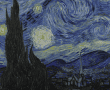
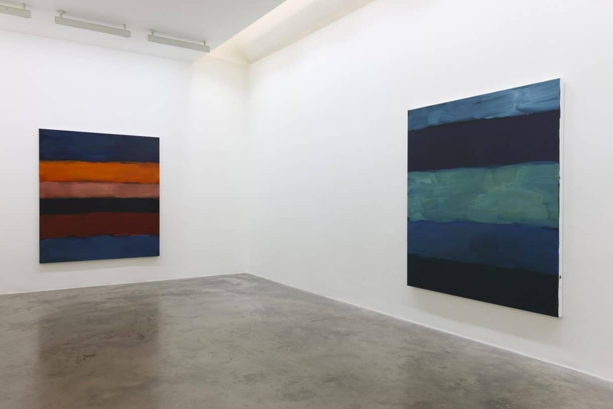
Shades are often used to create depth and richness in color schemes, adding a sense of drama and intensity to the overall composition. Darkening a hue with black can create a more moody and mysterious atmosphere. As shades approach black, they become increasingly darker, reducing the overall brightness and increasing the contrast within the color.
Tone
Tones are versatile and can add a sense of sophistication and subtlety to a color palette. They are often used to create harmonious and balanced compositions. Mixing white and black or adding gray to a hue creates a range of muted tones that have a reduced saturation and a more neutral appearance. Tones can evoke a sense of understated elegance and are commonly used in various art forms, interior design, and fashion.
Spotlight on Shade: Understanding its Role in Art
Defining Shade
In artistic language, a shade is fundamentally a hue or color that has been darkened by adding black to it. It’s the opposite of a tint, which is a hue lightened with white. The term ‘shade’ can also refer to the degree to which a color is darkened.

An example of a hue and its shades
| Hue | Shade 1 (with lesser black) | Shade 2 (with more black) |
|---|---|---|
| Red | Maroon | Blackish-Red |
| Blue | Navy Blue | Dark Blue |
The Importance of Shade in Art
Shading in art is a powerful tool that artists wield to create depth, mood, and visual interest. It can:
Create depth and volume
To create depth and volume in a two-dimensional artwork, artists employ shading techniques that utilize light and shadow. This enables them to give the illusion of three-dimensionality and emphasize the object’s volumetric properties. Here are some key points to consider:
- Shading: By varying the intensity of light and dark values, artists can create gradations of tone that simulate depth and volume. This technique involves carefully observing and rendering the values to represent the object’s form and spatial relationship;
- Light source: Understanding the direction and intensity of the light source is crucial. It helps determine where the light hits the object and where the shadows are cast. An accurate portrayal of the light source enhances the realism and three-dimensionality of the artwork;
- Shadows: Shadows play a vital role in defining the object’s form by indicating areas that are blocked from the light source. Artists observe how shadows interact with the object’s surface to accurately represent its shape. Shadows contribute significantly to the perception of depth and volume within the artwork.
Establish mood
Darker shades can elicit feelings of sadness, mystery, or suspense, while lighter shades can evoke feelings of happiness, calm, or hope. By using different shades, artists can create a specific mood or atmosphere in their work. Here are the key points to consider:
- Darker shades: Darker shades have the ability to elicit feelings of sadness, mystery, or suspense. By using deep shadows and intense colors, artists can create a somber or enigmatic mood in their artwork. These tones are often associated with dramatic or introspective themes, adding depth and complexity to the overall mood;
- Lighter shades: Lighter shades have the power to evoke feelings of happiness, calm, or hope. Artists can achieve this by utilizing pastel colors or bright, airy tones, creating a light-hearted or serene mood in their artwork. These shades are commonly associated with joyful or tranquil subjects, providing a sense of positivity and tranquility;
- Color symbolism: Artists frequently employ color symbolism to further enhance the desired mood. Colors carry inherent meanings and emotions, and artists strategically choose and combine colors to amplify the emotional impact of their work. Warm colors like red and orange can evoke passion or excitement, while cool colors like blue and green can evoke calmness or melancholy, allowing artists to effectively communicate specific moods to the viewer.
Guide the eye
Artists can use shades to guide the viewer’s eye around the artwork. By creating contrast between light and dark areas, they can highlight important elements and create a visual path through the composition. Important aspects for guiding the viewer’s eye through shading and contrast in artwork are:
- Contrast: Strategic incorporation of contrast between light and dark areas allows artists to direct the viewer’s attention to specific focal points or important elements within the artwork. By creating visual interest through contrast, artists ensure that the viewer’s gaze is guided along the intended path;
- Highlighting: Artists use shades to highlight significant elements within the composition. By employing lighter shades or adding highlights to certain areas, they draw attention to specific parts, creating focal points that naturally attract the viewer’s eye. This technique aids in guiding the eye and controlling the flow of visual exploration;
- Visual path: Through skillful use of shades, artists establish a visual path that leads the viewer’s eye from one point to another within the artwork. This can be achieved by gradually shifting shades, creating a sense of progression or movement, or by strategically placing contrasting elements that create directional cues.
The Relationship Between Shade, Tint, and Tone
Understanding the difference between shade, tint, and tone can improve your appreciation of art and your own artistic skills. Here’s a comparative analysis of these three concepts:
- Adding Black (Shade): Adding black to a hue darkens it and creates shades. This can make the hue appear richer and deeper, but also darker and potentially more intense;
- Adding White (Tint): Adding white to a hue lightens it, producing a tint. This can make the hue appear softer and less intense;
- Adding Gray (Tone): Mixing both white and black, or adding gray to a hue, results in a tone. Toning a hue dulls its intensity, making it less saturated and more subtle.
Comparison of Tint, Shade, and Tone
| Hue | Tint (Adding White) | Shade (Adding Black) | Tone (Adding Gray) |
| Green | Mint Green | Forest Green | Moss Green |
How Artists Use Shade, Tint, and Tone
Artists skillfully use shade, tint, and tone to create different effects in their artwork. These tools allow them to:
Create Contrast
This technique adds dynamism and visual interest to the composition, enhancing the overall impact of the artwork. Additionally, the juxtaposition of light and dark values creates a sense of depth and dimension, making the artwork more immersive for the viewer.
Depict Light and Shadow
This interplay of light and shadow adds realism and dimension to the artwork, making the objects appear three-dimensional and enhancing their visual impact. By skillfully manipulating tints, shades, and tones, artists can evoke a range of moods and atmospheres, further enhancing the narrative or emotional quality of the piece.
Evoke Emotions
By employing a wide range of shades, tints, and tones, artists have the power to evoke a profound emotional response from the viewer. The deliberate use of dark and light values creates a visual language that taps into our subconscious, allowing us to experience a diverse range of emotions such as melancholy, curiosity, serenity, or elation when engaging with the artwork.
Experimenting with Shade: Practical Application
For budding artists, knowing the theory is one thing, but applying it in practice is another. Here are some practical exercises you can undertake to master the use of shade in your artwork:
Shade Study
In this shade study exercise, you will select a specific hue and explore its transformation by gradually incorporating black. By adding varying amounts of black, you will observe the fascinating evolution of the color’s character. This activity aims to deepen your understanding of how shades influence the overall perception of color. Here’s a step-by-step breakdown:
- Select a hue;
- Gradually add black;
- Observe the changes;
- Document the shades;
- Analyze the results;
- Reflect on the findings.
Light and Shadow
In this exercise focused on light and shadow, you will create a monochromatic painting that utilizes various shades of a single hue. By mastering the art of capturing light and shadow, you will enhance your ability to convey volume and depth in your artwork. Here are the key steps involved:
- Select a hue;
- Understand the concept;
- Plan your composition;
- Create shades;
- Depict light and shadow;
- Refine and evaluate.
Mood Painting
In this mood painting exercise, you will explore how different shades can evoke contrasting moods within the same subject. By creating two paintings of the identical subject, one using darker shades to convey a somber mood and the other using lighter shades to create a happier mood, you will gain a deeper understanding of how shades can influence the overall emotional impact of an artwork. Here are the key steps involved:
- Choose a subject;
- Define the mood;
- Plan your compositions;
- Create darker shades;
- Capture the somber mood;
- Create lighter shades;
- Convey a happier mood.
Conclusion
The concept of shade is a vital component of color theory in art. It is an important tool that can enhance an artist’s work, adding depth, establishing mood, and guiding the viewer’s eye. By understanding and experimenting with shade, you can enrich your artistic skills and deepen your appreciation of art. As with any tool in art, the key is to practice and experiment, and in doing so, you’ll uncover your unique style and expression.